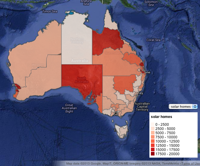
Ever wondered what solar power looks like in Australia? In the lead up to the Australian election, the Guardian UK created a map of solar power in Australia based on federal electorate. The data used to create the map is Clean Energy Regulator Data analysed by solar lobby group 100% Renewable Energy and SunWiz.
The Guardian’s interactive map allows you to explore the distribution of solar power in Australia and shows the increasing popularity of this source of power. The details in this map also help you to understand why so many Australians are moving to solar power. To give you an example close to home: Wide Bay has 13,631 homes with solar power. In total, these homes have saved over 7 and a half million dollars in power bills and 42, 597 tonnes of CO2. Pretty impressive right?
The rapid increase in green energy solutions in Australia has also been highlighted in a new report from the Australian Energy Market Operator. This report shows that Australia’s coal-fired electricity grid is rapidly changing, with every new electricity proposal from the past year being for either large scale wind farms or solar facilities. This shows that solar power is not only gaining momentum on a small scale with homes, but it is also having an impact on a larger scale in Australia.